When shooting for a designer/manufacturer/builder/contractor, your interiors photography composition becomes more flexible. With real estate photography, you generally shoot wide to show the entire space. However when shooting interiors, clients want more detail photos and alternate angles.
Below are some ideas for different compositions you can experiment with when shooting for an interior designer.
1. Shoot Vertical
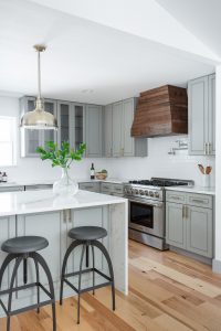
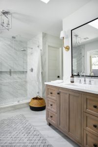
One awesome positive of shooting interiors is being able to shoot vertical compositions! Sure, you can shoot vertical when doing real estate. However the majority of listing websites have designs that work best for horizontal/landscape oriented photographs.
Designers undoubtedly want to share their photos on social media. Vertical images fill mobile screens and offer a better viewing experience.
They also want to get published in magazines (and so do you)! Vertical images give editors options when space is at a premium. Offering both vertical and horizontal images enables editors to better place photos in an article that may not have much room for adjustment.
2. Show Depth of Field
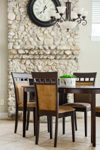
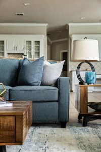
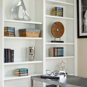
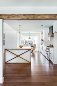
Introducing depth of field with parts of the image in focus and others blurred out can add interest. It can also emotionally draw in the viewer, or be used to highlight something specific.
To increase depth of field, use a lens with a bigger aperture and/or longer focal length. Frame your shots so some things are close to the camera and others are far away. Having a peek of an object at the edge of the frame that is blurred out can add interest due to the depth it implies.
3. Shoot Head On
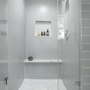
Clean lines and simplicity help make head on shots intriguing to look at. Whether you are shooting wide or zooming in, be sure all of your lines are horizontal/vertical. Be careful, as a head on shot can look sloppy if your lines aren’t perfect.
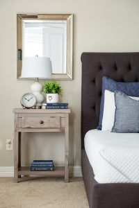
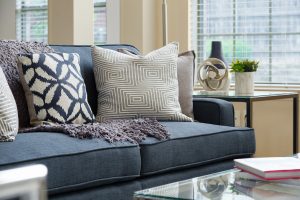
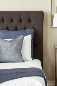
Bedroom nightstands make a great interiors photography composition. Also, edges of sofas with pillows really stand out when shot head on.
4. Highlight Details
You usually won’t be shooting details in real estate photography because Realtors like wide photos. That changes with interiors photography for designers.
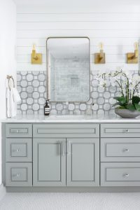
Take the time to highlight details like tile, mirrors, accessories and finish outs. Designers brand themselves through their work and it will help them draw in more clients who like the same aesthetic.
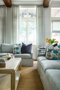
Shoot close ups of pillows and coffee tables. Zoom in to drapery or flooring to show details. Help the designer tell their story, through photos.
5. Shoot Wide
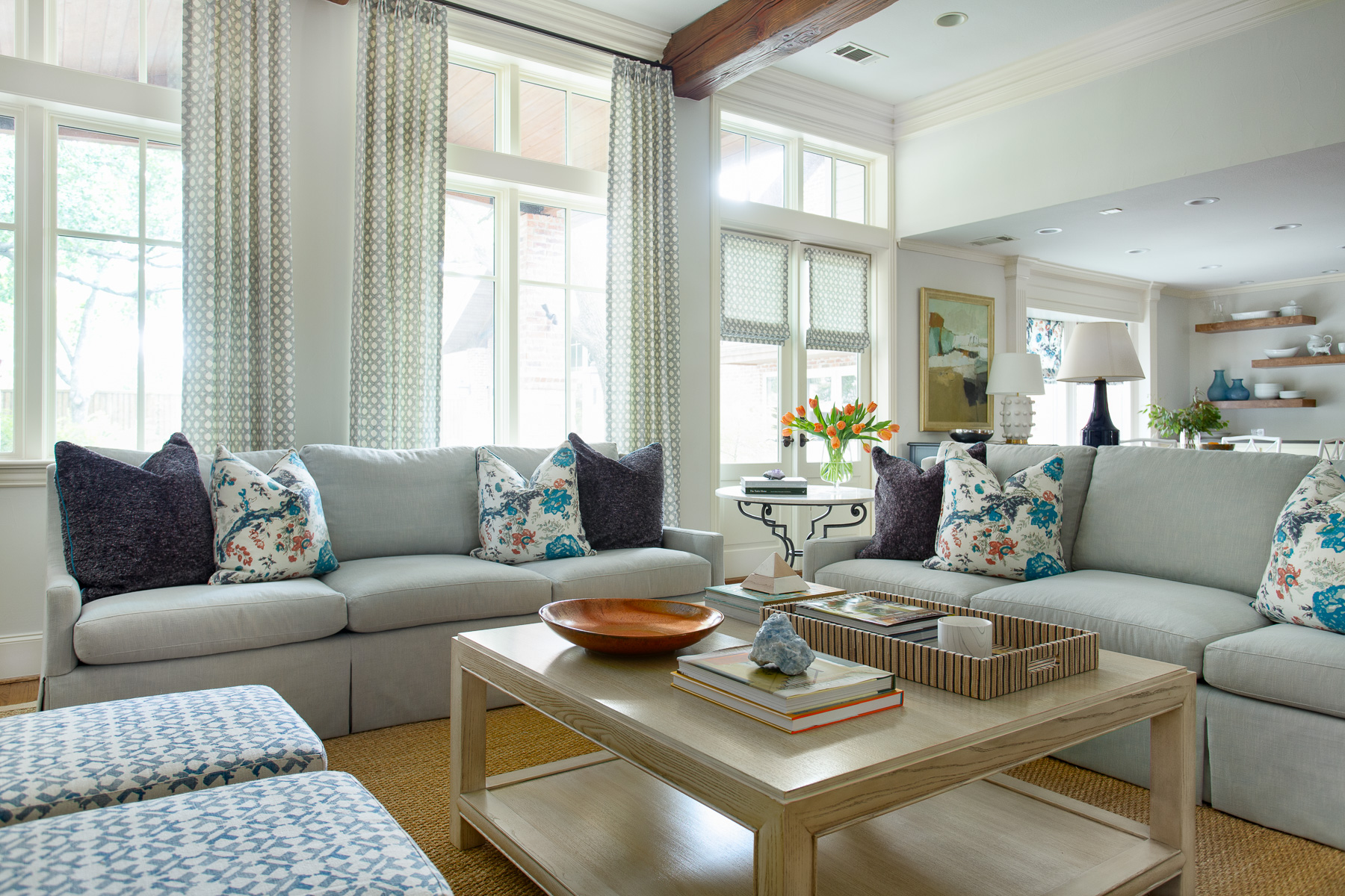
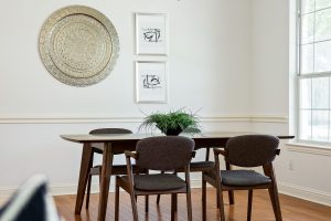
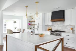
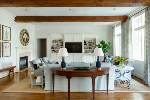
Just because you’ll be focused on other compositions doesn’t mean you don’t need to shoot wide for designers. The difference? For real estate you may deliver four wide shots of a living room. For a designer, perhaps just one. They still like the wide shot however, as it showcases the whole design.
Generally a couple of wide shots of a given space will be plenty for a designer. They will then like tighter vignette/detail shots to compliment the space. Shoot your wide shots head on or from an angle, whatever will best show the space.
6. Shoot “Afters”
Some designers, especially those doing renovation/remodel projects, will have “before” photos. Request them, and choose a couple to shoot identical “after” photos. Showing before/afters is a great marketing tool. The designer can show what they started with and the drastic change once the project was complete.
Don’t forget that before/afters are also great for you! They will showcase the difference you make with your photography. Matching up a “before” photo shot with a phone or pocket camera to your professional version is a great way for potential clients to see what you bring to the table.
Think about ways you can improve or adjust your interiors photography composition to deliver exceptional and interesting images. Follow photographers on social media or look in magazines for inspiration. You’ll soon start to recognize what you and your clients like, and will be able to deliver winning shots at every shoot.
Loved your website, lots of photography tips all around the web, but not much on real estate photography, a very underrated nitch.
you should post photographies not 3d renders as examples…just an advise 😉
The images were all taken by me and are NOT “3d renders”. Thank you for the compliment though! 🙂
Im dead lol
Very interesting. I bought a 50mm f/1.8 for focused photos. Thank you, Lance.
Great in depth article, that is something I need to do more is capturing spaces vertically. Also very nice photos!